I've been stocking up and getting ready for another 9 credits from hell. Here is an award that I neglected to give for 2005.
A little background...I find campaign signs a waste of money, paper and ink. Sure they make a person feel better when they stick a sign in their yard and it might add to some "street cred" if you have a lot in the neighborhood but you would be better to stick that money into something like a good database or a couple of extra canvassers. Signs are not the worst thing a campaign can spend their money on (BUMPER STICKERS!) but they aren't that valuable of a comodity for a campaign either.
That being said, if you are going to buy campaign signs for the love of God don't be a nuisance about it! The three rules are 1)pick good colors that don't strain the eye (the less, the better), 2) make your candidate's name stand out (it's not a good sign if I have to squint to see the words), and 3)don't put them in a pattern that is ridiculous looking, can cause traffic problems and is annoying to the neighborhood.
Without further delay, I welcome you to the "Joadies"!
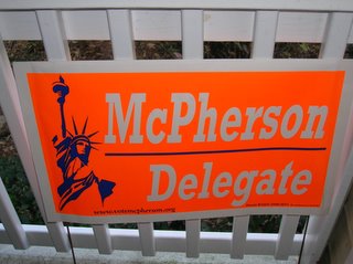
Here is my nomination for "2005 Worst Sign of the Year":

Awful...awful sign! Can we get a brighter
orange? Did we get a special on signs from an outdoorsman convention? These atrocious signs were found on Braddock Road during the '05 campaign. They are from the
Scott Mcpherson for Delegate campaign. I understand he's a Libertarian candidate and that should afford him some slack but I don't cut any slack when my retinas are seared for nearly 2 months with these sickly signs! By the way, try picking them up a week after the election...not nearly a month later!
This begs the question: who thought up the design of this sign? If it was the candidate, that means this guy needs a campaign manager. If he had a campaign manager, they should have been fired immediately for this sign. No question...end of story.
Okay, maybe this isn't the end of the story! What's that mysterious blue thing on the sign...oh it's the
Statue of Liberty! I get it you're a Libertarian but just in case you didn't notice, this sort of thing is hard to pick out while I whizz by at 50 mph. It honestly took me 3-4 drive-bys to finally get what the image was. Next time use this space to highlight your name...which brings me to the next point...
What in the hell was this campaign thinking when they used bleach white with "Deer Hunt" orange? Scroll back up to the sign and stare at it for about 10 seconds. Now find something white to stare at. It's like that
Jesus image that makes it way into my Inbox once a year! This sign actually makes your eyes want to avert their attention from it! What's the point of having a sign then!?!
Bitterness...over.
This is Part 1 of a 3 part series...stay tuned...I will shock you with my next sign award...(hint: I'm a Democrat)


